Workflows#
1. Standardization of Data#
What it is: PCA is sensitive to the scale of variables. Features with larger scales can dominate the principal components.
How it’s done: Subtract the mean and divide by standard deviation for each feature:
Intuition: Imagine mixing apples and oranges in a basket. If you don’t standardize, the “size of the fruit” dominates your analysis. Standardization puts all features on the same scale.
2. Compute Covariance Matrix#
What it is: A square matrix that shows how variables vary together.
Formula: For standardized data matrix \(X\) (with \(n\) samples):
Intuition: Covariance tells you which variables are moving together. Positive covariance = move in same direction, negative = move oppositely.
3. Eigen Decomposition#
What it is: Compute eigenvectors and eigenvalues of the covariance matrix.
Eigenvectors → directions of maximum variance (principal components)
Eigenvalues → magnitude of variance along each principal component
Intuition: Think of the data as a cloud of points in space. Eigenvectors find the axes along which the cloud is most stretched, and eigenvalues measure how stretched.
4. Sort Eigenvectors by Eigenvalues#
Process:
Rank eigenvectors from largest to smallest eigenvalue
Select top k eigenvectors to reduce dimensions
Intuition: Bigger eigenvalue → more variance explained. Keep top k vectors that capture most “information.”
5. Transform Original Data#
Process: Multiply original standardized data \(X\) by the matrix of selected eigenvectors \(W\):
Result: New data in lower-dimensional space, called principal components.
Intuition: You’re rotating and projecting the data into a new coordinate system where axes are ordered by importance.
6. (Optional) Explained Variance Analysis#
Process: Compute the fraction of total variance each principal component explains:
Purpose: Helps decide how many components to keep.
Intuition: If first 2 PCs explain 90% variance, you can reduce to 2 dimensions without losing much information.
Summary#
Standardize Data → 2. Covariance Matrix → 3. Eigen Decomposition → 4. Select Top Eigenvectors → 5. Transform Data → 6. Check Explained Variance
import numpy as np
import matplotlib.pyplot as plt

# Generate 2D data
np.random.seed(42)
mean = [2, 3]
cov = [[3, 1.5], [1.5, 1]]
X = np.random.multivariate_normal(mean, cov, 100)

# Compute PCA manually
X_meaned = X - np.mean(X, axis=0)
cov_matrix = np.cov(X_meaned, rowvar=False)
eig_vals, eig_vecs = np.linalg.eigh(cov_matrix)
# Sort eigenvectors by eigenvalues
sorted_index = np.argsort(eig_vals)[::-1]
eig_vals = eig_vals[sorted_index]
eig_vecs = eig_vecs[:, sorted_index]
# Project data onto first PC
X_pca = X_meaned @ eig_vecs

# Plot original data and principal components
plt.figure(figsize=(8,8))
plt.scatter(X[:,0], X[:,1], alpha=0.5, label='Data points')
origin = np.mean(X, axis=0)
for i in range(2):
    plt.quiver(*origin, *eig_vecs[:,i]*np.sqrt(eig_vals[i])*2, angles='xy', scale_units='xy', scale=1, color=['r','g'][i], label=f'PC{i+1}')

# Project points onto first PC
pc1_line = np.outer(X_pca[:,0], eig_vecs[:,0])
projected_points = origin + pc1_line
plt.scatter(projected_points[:,0], projected_points[:,1], alpha=0.5, color='orange', label='Projection onto PC1')

plt.xlabel('X1')
plt.ylabel('X2')
plt.title('PCA Visualization with Projections')
plt.legend()
plt.grid(True)
plt.axis('equal')
plt.show()
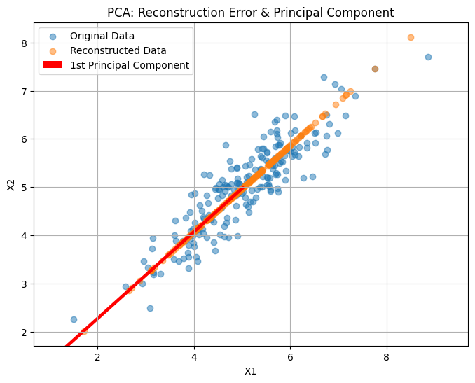
Here’s a visual demonstration of PCA:
The scatter points show the original 2D data.
The red and green arrows are the first and second principal components (PC1 and PC2), indicating directions of maximum variance.
The orange points show the projection of the original data onto PC1, effectively reducing the dimensionality from 2D to 1D while retaining the most variance.
import numpy as np
import matplotlib.pyplot as plt
# Generate synthetic 2D data
np.random.seed(42)
X = np.dot(np.random.rand(2, 2), np.random.randn(2, 200)).T + np.array([5, 5])
# Mean center the data
X_centered = X - X.mean(axis=0)
# Compute covariance matrix and eigenvectors/values
cov_matrix = np.cov(X_centered, rowvar=False)
eigenvalues, eigenvectors = np.linalg.eigh(cov_matrix)
# Sort eigenvectors by eigenvalues (descending)
idx = np.argsort(eigenvalues)[::-1]
eigenvectors = eigenvectors[:, idx]
eigenvalues = eigenvalues[idx]
# Project data onto first principal component
PC1 = eigenvectors[:, 0].reshape(-1, 1)
Z1 = X_centered @ PC1
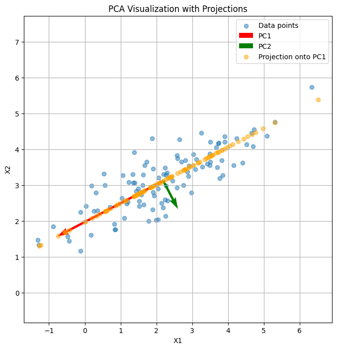
X_reconstructed = Z1 @ PC1.T + X.mean(axis=0)
# Plot original data, principal component, and reconstruction
plt.figure(figsize=(8, 6))
plt.scatter(X[:, 0], X[:, 1], alpha=0.5, label='Original Data')
plt.scatter(X_reconstructed[:, 0], X_reconstructed[:, 1], alpha=0.5, label='Reconstructed Data')
plt.quiver(X.mean(axis=0)[0], X.mean(axis=0)[1],
PC1[0, 0]*3, PC1[1, 0]*3, color='red', scale=1, label='1st Principal Component')
plt.title("PCA: Reconstruction Error & Principal Component")
plt.xlabel("X1")
plt.ylabel("X2")
plt.legend()
plt.axis('equal')
plt.grid(True)
plt.show()