Regression & Classification#
1. KNN for Classification#
Goal: Assign a class label to a new data point based on its neighbors.
Step-by-Step Process:#
Choose
k– the number of nearest neighbors to consider.Compute distances – calculate the distance between the new point and all points in the training set (commonly Euclidean).
Find nearest neighbors – select the
kpoints closest to the new point.Vote for the class – the most frequent class among the neighbors is assigned to the new point.
Optional: use distance weighting, so closer neighbors count more in voting.
Example Intuition:#
Imagine a 2D plot:
Red and Blue points represent two classes.
A new point appears (green).
If its 3 nearest neighbors are 2 red and 1 blue → predict Red.
Metrics for Evaluation:#
Accuracy, Precision, Recall, F1-score, Confusion Matrix.
2. KNN for Regression#
Goal: Predict a continuous value for a new data point.
Step-by-Step Process:#
Choose
k– number of nearest neighbors.Compute distances – measure closeness between the new point and all training points.
Find nearest neighbors – select the
kclosest points.Average the values – the predicted value is the mean (or weighted mean) of the neighbors’ target values.
Optional: weight neighbors inversely by distance.
Example Intuition:#
Suppose you want to predict house prices based on size.
A new house appears.
Take the
knearest houses by size and average their prices → predicted price.
Metrics for Evaluation:#
Mean Squared Error (MSE), Root Mean Squared Error (RMSE), Mean Absolute Error (MAE), R² score.
3. Key Differences Between Classification and Regression#
Aspect |
Classification |
Regression |
|---|---|---|
Output |
Discrete class label |
Continuous numeric value |
Prediction Method |
Majority vote of neighbors |
Mean (or weighted mean) of neighbors |
Evaluation Metrics |
Accuracy, Precision, Recall, F1 |
MSE, RMSE, MAE, R² |
Example |
Predict if email is spam or not |
Predict house price |
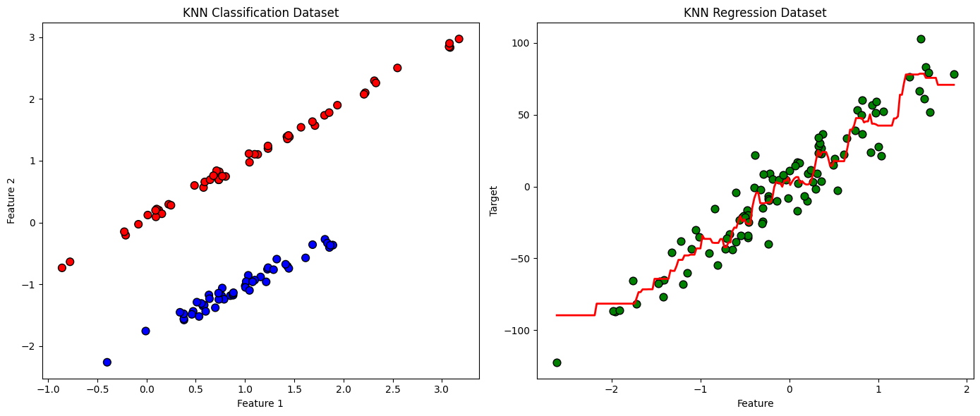
4. Visualization Example (Intuition)#
Classification: points in 2D space colored by class. A new point takes the class of majority of nearby points.
Regression: points in 2D space with numeric values. The new point’s value is averaged from nearby points.
KNN is powerful because it’s simple, intuitive, and non-parametric, but its performance depends heavily on:
Choice of
kDistance metric
Feature scaling
import numpy as np
import matplotlib.pyplot as plt
from sklearn.datasets import make_classification, make_regression
from sklearn.neighbors import KNeighborsClassifier, KNeighborsRegressor

# Classification dataset
X_clf, y_clf = make_classification(n_samples=100, n_features=2, n_informative=2,
                                   n_redundant=0, n_clusters_per_class=1, random_state=42)
# Regression dataset
X_reg, y_reg = make_regression(n_samples=100, n_features=1, noise=15, random_state=42)

# KNN Classifier
knn_clf = KNeighborsClassifier(n_neighbors=5)
knn_clf.fit(X_clf, y_clf)

# KNN Regressor
knn_reg = KNeighborsRegressor(n_neighbors=5)
knn_reg.fit(X_reg, y_reg)

# Plotting Classification
plt.figure(figsize=(14,6))
plt.subplot(1,2,1)
plt.scatter(X_clf[:,0], X_clf[:,1], c=y_clf, cmap='bwr', edgecolor='k', s=60)
plt.title('KNN Classification Dataset')
plt.xlabel('Feature 1')
plt.ylabel('Feature 2')

# Plotting Regression
plt.subplot(1,2,2)
plt.scatter(X_reg[:,0], y_reg, color='green', edgecolor='k', s=60)
# Generate predictions for a smooth line
X_line = np.linspace(X_reg.min(), X_reg.max(), 200).reshape(-1,1)
y_line = knn_reg.predict(X_line)
plt.plot(X_line, y_line, color='red', linewidth=2)
plt.title('KNN Regression Dataset')
plt.xlabel('Feature')
plt.ylabel('Target')

plt.tight_layout()
plt.show()