Polynomial Regression#
Polynomial Regression is an extension of Linear Regression where instead of fitting a straight line, we fit a curved line (polynomial curve) to capture non-linear relationships between the independent variable(s) and the target.
👉 While Linear Regression assumes the relationship is:
Polynomial Regression allows higher-degree terms:
Here:
\(d\) = degree of polynomial (2 for quadratic, 3 for cubic, etc.)
The higher the degree, the more flexible (but also more prone to overfitting).
Intuition#
Imagine your dataset looks like a curve (U-shape, S-shape, wave-like).
A straight line (Linear Regression) cannot capture this curvature well → it will have large errors.
Polynomial Regression adds powers of x (\(x^2, x^3, ...\)) as extra features, allowing the model to bend and better follow the data.
Think of it as Linear Regression on transformed features:
Steps to Perform Polynomial Regression#
Prepare data (independent variable \(x\), target variable \(y\)).
Transform features – generate polynomial features (e.g., \(x^2, x^3\)).
Apply Linear Regression on these new features.
Fit and evaluate the curve.
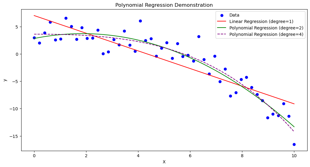
Visualization#
Here’s how Polynomial Regression works compared to Linear Regression:
Linear Regression (degree 1): Straight line
Polynomial Regression (degree 2 or higher): Curve fits the dataset
📊 Imagine points shaped like a parabola (U-shaped).
Linear Regression → draws a straight line (bad fit).
Polynomial Regression (degree 2) → draws a U-shape curve (good fit).
Advantages#
✅ Can model non-linear relationships ✅ Easy to implement (just transform features, then use Linear Regression) ✅ Often improves accuracy over simple linear models
Disadvantages#
⚠️ Higher-degree polynomials → risk of overfitting ⚠️ Becomes computationally expensive as degree grows ⚠️ Extrapolation (predicting outside data range) is very unreliable
###Example (Quadratic Regression)
Suppose house prices grow with square footage but with a curve (diminishing returns).
Equation could look like:
Small homes → price grows fast
Large homes → price growth slows down
A quadratic curve captures this better than a straight line.
📌 Would you like me to generate Python code with plots to show:
Linear Regression line (bad fit)
Polynomial Regression curves (degree 2, degree 3) for the same dataset
That way you’ll see how the curve improves as degree increases.
import numpy as np
import matplotlib.pyplot as plt
from sklearn.linear_model import LinearRegression
from sklearn.preprocessing import PolynomialFeatures

# Generate sample data
np.random.seed(42)
X = np.linspace(0, 10, 50).reshape(-1, 1)
y = 2 + 1.5 * X - 0.3 * X**2 + np.random.normal(0, 2, size=X.shape)

# Linear Regression (degree=1)
lin_reg = LinearRegression()
lin_reg.fit(X, y)
y_pred_linear = lin_reg.predict(X)

# Polynomial Regression (degree=2)
poly = PolynomialFeatures(degree=2)
X_poly = poly.fit_transform(X)
poly_reg = LinearRegression()
poly_reg.fit(X_poly, y)
y_pred_poly = poly_reg.predict(X_poly)

# Polynomial Regression (degree=4 for overfitting demo)
poly4 = PolynomialFeatures(degree=4)
X_poly4 = poly4.fit_transform(X)
poly_reg4 = LinearRegression()
poly_reg4.fit(X_poly4, y)
y_pred_poly4 = poly_reg4.predict(X_poly4)

# Plot results
plt.figure(figsize=(12, 6))

# Scatter points
plt.scatter(X, y, color="blue", label="Data")

# Plot Linear Regression
plt.plot(X, y_pred_linear, color="red", label="Linear Regression (degree=1)")

# Plot Polynomial Regression (degree=2)
plt.plot(X, y_pred_poly, color="green", label="Polynomial Regression (degree=2)")

# Plot Polynomial Regression (degree=4)
plt.plot(X, y_pred_poly4, color="purple", linestyle="--", label="Polynomial Regression (degree=4)")

# Labels
plt.title("Polynomial Regression Demonstration")
plt.xlabel("X")
plt.ylabel("y")
plt.legend()
plt.show()