Workflows#
Problem Definition
Identify the task as a classification problem (binary or multi-class).
Example: Predict whether a customer will churn (Yes/No).
Data Collection and Preprocessing
Collect labeled dataset.
Handle missing values, categorical encoding, scaling if required.
Split data into training and test sets.
Model Formulation
Linear combination:
\[ z = \theta_0 + \theta_1 x_1 + \theta_2 x_2 + \dots + \theta_n x_n \]Apply sigmoid function:
\[ h_\theta(x) = \frac{1}{1 + e^{-z}} \]Output is probability \(P(y=1|x)\).
Decision Rule
Assign class based on threshold (default 0.5).
If \(h_\theta(x) \geq 0.5\) → predict 1, else 0.
Cost Function
Use log-loss (cross-entropy):
\[ J(\theta) = -\frac{1}{m}\sum_{i=1}^m \big[y^{(i)}\log(h_\theta(x^{(i)})) + (1-y^{(i)})\log(1-h_\theta(x^{(i)}))\big] \]Convex, so guarantees global minimum.
Optimization
Use Gradient Descent to update parameters:
\[ \theta_j = \theta_j - \alpha \frac{\partial J(\theta)}{\partial \theta_j} \]
Model Training
Iterate until convergence or maximum epochs.
Model Evaluation
Use metrics beyond accuracy: Precision, Recall, F1-score, ROC-AUC, Confusion Matrix.
Prediction
Apply model to new unseen data for classification.
Deployment and Monitoring
Integrate into production.
Monitor drift, retrain if data distribution changes.
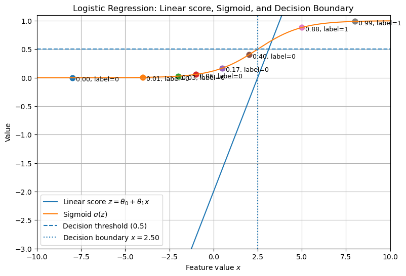
# Generating a single plot showing the linear score z, its sigmoid, and decision boundary.
import numpy as np
import matplotlib.pyplot as plt

# Parameters
theta0 = -2.0
theta1 = 0.8

# Input range
x = np.linspace(-10, 10, 400)
z = theta0 + theta1 * x
sigmoid = 1 / (1 + np.exp(-z))

# Sample points to illustrate classification
x_samples = np.array([-8, -4, -2, -1, 0.5, 2, 5, 8])
z_samples = theta0 + theta1 * x_samples
probs_samples = 1 / (1 + np.exp(-z_samples))
labels = (probs_samples >= 0.5).astype(int)

plt.figure(figsize=(9,6))
plt.plot(x, z, label='Linear score $z=\\theta_0+\\theta_1 x$')
plt.plot(x, sigmoid, label='Sigmoid $\\sigma(z)$')
plt.axhline(0.5, linestyle='--', label='Decision threshold (0.5)')
# Decision boundary where z = 0 -> x = -theta0/theta1
x_boundary = -theta0 / theta1
plt.axvline(x_boundary, linestyle=':', label=f'Decision boundary $x={x_boundary:.2f}$')

# Plot sample points and their probabilities
for xi, pi, li in zip(x_samples, probs_samples, labels):
    plt.scatter([xi], [pi], s=60)
    plt.text(xi + 0.2, pi - 0.06, f'{pi:.2f}, label={li}', fontsize=9)

plt.xlabel('Feature value $x$')
plt.ylabel('Value')
plt.title('Logistic Regression: Linear score, Sigmoid, and Decision Boundary')
plt.legend()
plt.grid(True)
plt.ylim(-3, 1.1)
plt.xlim(x.min(), x.max())
plt.show()
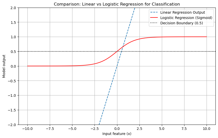
import numpy as np
import matplotlib.pyplot as plt

# Generate input data
x = np.linspace(-10, 10, 200)

# Linear regression output
linear_output = x  # straight line

# Logistic regression output (sigmoid)
sigmoid_output = 1 / (1 + np.exp(-x))

# Plot comparison
plt.figure(figsize=(10,6))
plt.plot(x, linear_output, label="Linear Regression Output", linestyle="--")
plt.plot(x, sigmoid_output, label="Logistic Regression (Sigmoid)", color="red")

# Mark decision boundary at 0.5 for logistic regression
plt.axhline(0.5, color="black", linestyle=":", label="Decision Boundary (0.5)")

# Formatting
plt.ylim(-2, 2)
plt.xlabel("Input feature (x)")
plt.ylabel("Model output")
plt.title("Comparison: Linear vs Logistic Regression for Classification")
plt.legend()
plt.grid(True)
plt.show()