Performance Metrics#
Confusion Matrix#
A summary table of predictions vs. actual outcomes.
Predicted Positive |
Predicted Negative |
|
|---|---|---|
Actual Positive |
True Positive (TP) |
False Negative (FN) |
Actual Negative |
False Positive (FP) |
True Negative (TN) |
Helps derive all other metrics.
Accuracy#
Overall correctness of the model.
Good when classes are balanced, misleading if data is imbalanced.
Precision (Positive Predictive Value)#
Out of all predicted positives, how many are actually positive?
Useful when false positives are costly (e.g., spam filters).
Recall (Sensitivity / True Positive Rate)#
Out of all actual positives, how many did we correctly predict?
Useful when false negatives are costly (e.g., disease detection).
Specificity (True Negative Rate)#
Out of all actual negatives, how many did we correctly predict?
Complements recall: focuses on negatives.
F1 Score#
Harmonic mean of precision and recall.
Good when we need a balance between precision and recall.
F-beta Score#
Weighted version of F1.
β > 1 → more weight on recall.
β < 1 → more weight on precision.
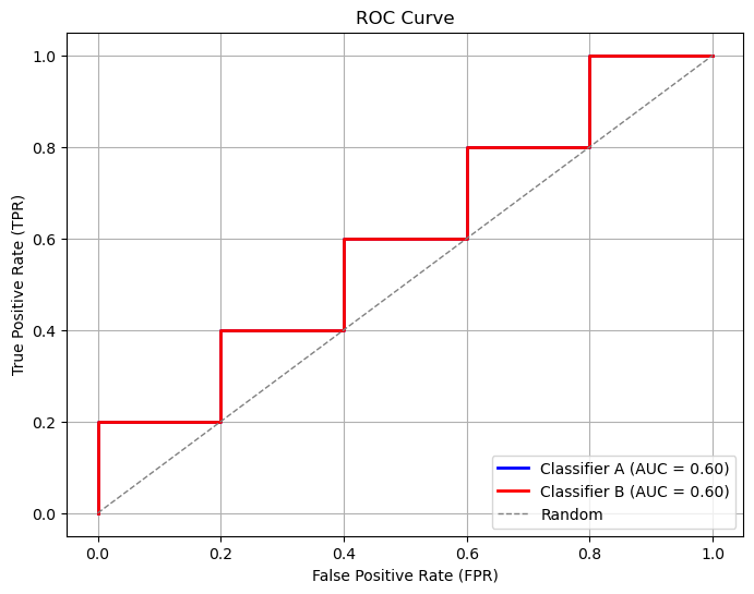
ROC Curve & AUC#
ROC Curve: Plots TPR (Recall) vs. FPR (1 - Specificity) at different thresholds.
AUC (Area Under Curve): Measures how well the model separates classes.
AUC = 1 → perfect model.
AUC = 0.5 → random guessing.
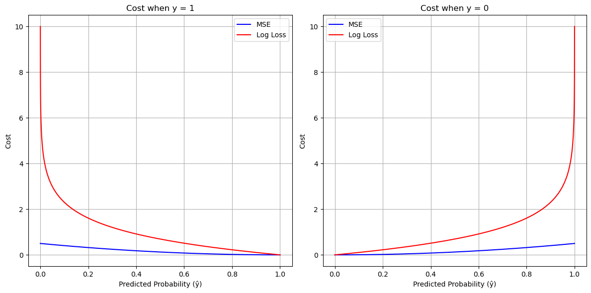
Log Loss (Cross-Entropy Loss)#
Measures how well predicted probabilities match actual labels.
Lower log loss = better model.
Summary:
Accuracy → overall correctness (works best for balanced data).
Precision → good when FP is costly.
Recall → good when FN is costly.
F1 / F-beta → balance precision and recall.
ROC-AUC → good for comparing models.
Log Loss → probability-based evaluation.
import numpy as np
import matplotlib.pyplot as plt

# Define sigmoid function
def sigmoid(z):
    return 1 / (1 + np.exp(-z))

# Define MSE cost for binary classification
def mse_cost(y, y_hat):
    return 0.5 * (y_hat - y)**2

# Define log loss cost
def log_loss(y, y_hat):
    eps = 1e-10  # avoid log(0)
    return -(y*np.log(y_hat + eps) + (1-y)*np.log(1 - y_hat + eps))

# Generate predictions from sigmoid
z = np.linspace(-10, 10, 200)
y_hat = sigmoid(z)

# Compute costs for y=1 and y=0
mse_y1 = mse_cost(1, y_hat)
mse_y0 = mse_cost(0, y_hat)
log_y1 = log_loss(1, y_hat)
log_y0 = log_loss(0, y_hat)

# Plotting
plt.figure(figsize=(12, 6))

# For y=1
plt.subplot(1, 2, 1)
plt.plot(y_hat, mse_y1, label="MSE", color="blue")
plt.plot(y_hat, log_y1, label="Log Loss", color="red")
plt.title("Cost when y = 1")
plt.xlabel("Predicted Probability (ŷ)")
plt.ylabel("Cost")
plt.legend()
plt.grid(True)

# For y=0
plt.subplot(1, 2, 2)
plt.plot(y_hat, mse_y0, label="MSE", color="blue")
plt.plot(y_hat, log_y0, label="Log Loss", color="red")
plt.title("Cost when y = 0")
plt.xlabel("Predicted Probability (ŷ)")
plt.ylabel("Cost")
plt.legend()
plt.grid(True)

plt.tight_layout()
plt.show()
import numpy as np
import matplotlib.pyplot as plt
from sklearn.metrics import roc_curve, auc

# Simulated probabilities and true labels
y_true = np.array([1, 0, 1, 0, 1, 0, 1, 0, 1, 0])
y_scores_a = np.array([0.9, 0.8, 0.7, 0.6, 0.5, 0.4, 0.3, 0.2, 0.1, 0.05])
y_scores_b = np.array([0.7, 0.6, 0.5, 0.4, 0.3, 0.2, 0.1, 0.05, 0.02, 0.01])

# Compute ROC curves
fpr_a, tpr_a, _ = roc_curve(y_true, y_scores_a)
fpr_b, tpr_b, _ = roc_curve(y_true, y_scores_b)

# Compute AUC
auc_a = auc(fpr_a, tpr_a)
auc_b = auc(fpr_b, tpr_b)

# Plot
plt.figure(figsize=(8, 6))
plt.plot(fpr_a, tpr_a, color='blue', lw=2, label=f'Classifier A (AUC = {auc_a:.2f})')
plt.plot(fpr_b, tpr_b, color='red', lw=2, label=f'Classifier B (AUC = {auc_b:.2f})')
plt.plot([0, 1], [0, 1], color='gray', lw=1, linestyle='--', label='Random')
plt.xlabel('False Positive Rate (FPR)')
plt.ylabel('True Positive Rate (TPR)')
plt.title('ROC Curve')
plt.legend(loc='lower right')
plt.grid(True)
plt.show()